We’ve all seen braille buttons and signs posted on the drive-up ATM, and many people (unfortunately) then have to mutter to their travelling companions, “hey, look at the braille on the drive-up ATM? How many blind people drive?”
Let’s be honest – the real trick is not that their are braille-labelled buttons on the drive-through ATM, but that the buttons are associated with a display screen.
There’s no braille on the screen, so how would a blind person know which button to select? Oh, we know there’s an easy answer to this, but Web Watch likes to point it out anyway. It may be practical to the blind, but to a sighted person, it just looks like bad design.
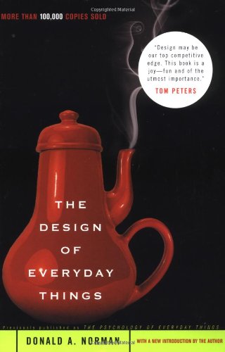
And if you notice this type of bad design in your everyday life, you may want to check out Michael Darnell’s compilation of bad designs, aptly named BAD DESIGNS.
His site has tons of examples of bad designs, ranging from “which side of the car has the gas cap” (it’s the one that the “fuel door arrow” is pointing to on the dash), to “how do I use the coffee machine”?
A general rule of thumb is that if what you created needs a sign to explain what it is (or isn’t), then maybe you’ve made things a bit more complicated than they should be.
Take, for example, Michael’s suggestion for how to improve the simple rolled condom. Invariably, these are attempted to be unrolled in the wrong direction – especially while in the dark and/or in some passionate embrace. Michael suggests that the inside/outside should be different colors or textures to indicate which side is which.
Have you run into signs or products that are just plain dumb in the way they were designed? List your not-so-favorites in the comments…

